For me l like each one of these fonts as l think they are all sophisticated, stylish and simplistic, which is how l want to stylise my portfolio.
Typography & Colour
Before l actually create my logo on photoshop l want to look at potential colour-ways and different type faces to ensure that l have the correct style to use within my logo. My initial process was to being with fonts, as all of my designs involve my name or initials, the type face, font, size, are all important in creating a sophisticated and stylish logo and portfolio.To create a coherent website, the same typefaces will be used on all pages of my website.

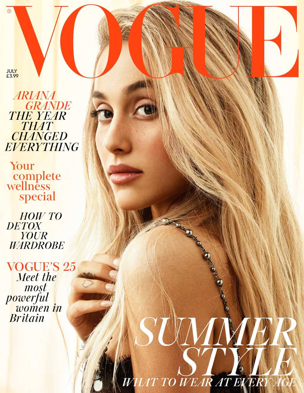 I decided that for my typeface l wanted to experiment with both San-Serif and Serif fonts as l think they both have different finishes and can symbolise different meanings. For me, Serif fonts remind me of companies like Vogue, they're stylish, exciting and have a younger appeal. Whereas Sans-Serif fonts are often used to represent companies or products that are clean, minimal but also stylish. My favourite fonts would be Didot and Sinhala MN as l think these both convey a young, modern and clean appeal. Something that l think would work really nicely to represent a media practitioner. Sinhala MN appears to fit some of my initial logo sketches better, as the letters flow smoothly and have a softer appeal in comparison to Didot. I think it also looks more unique, as the other fonts remind me of vogue and a have a closer symbolic appeal to the fashion industry apposed to the media industry.
For what l want, simplistic, stylish, Sinhala MN is the better font and something l will test later when l come to create the digital versions of my logos.
Colour Theory
Although l had chosen colours from my original CV, again l wanted to experiment with different colour palettes and look into colour theory and representation of colours. I created a simple colour wheel and then colour combinations to see what colours l think worked well together and what is the best colours for my generic house styles of my brand.

I chose four different core colours and then experimented with varying shades. I wanted to use softer colours as l want to have more muted and pastel house colours to create a softer appeal and to put more emphasis on the content on the website in comparison to if l used more harsh bright house styles it would take the emphasis away from my websites content.
I used purples and lilacs as it represents a more luxury appearance and is elegant, while still being playful and exciting. I thought the lilac shades were different and a unique colour choice for a branding, it stands out without being a offensive colour.
I used blacks and greys are neutral tones that are timeless. I like to incorporate black, grey or white into my designs to add a level or power and authority, to present my confidence and position in the industry. These cool toned colours are also great to balance out colours and they go with the majority of colours on my colour wheel. While presenting a modern style, blacks and greys promote the seriousness of my brand and the legitimacy of my experiences and career ambitions.
Outside of my comfort zone, and usual colour palette, l decided to also incorporate muted reds and oranges as l thought the pop of colour could be a fun add in to my ouse style and something that would catch the attention of my audience. These colours feel exciting and fresh, but my main concern would be whether they are too youthful for the brand l am trying to achieve and would they soon become outdated? I want the colour scheme l chose to grow with me as a professional, which is why l avoided bright colours as l think l would grow beyond the brand and have to re-stylise it, which is something l don't want to do when l move into the media industry as it would mean altering all of my design assets.
After combining colours together and experimenting with them, l want to trial the lilac and grey colour scheme, as l think it is stylish and unique without being too much. I want to use these as my general house styles for my website, branding and social media.

No comments:
Post a Comment