Friday, March 29, 2019

Creating a Brand: Portfolio Work Selection

To present myself as a well rounded individual and a media practitioner, l wanted to choose my the photography, design and videography that l was most proud of and that fitted with the general design of my layout. I didn't want to over fill my website with material so carefully chose the content that l thought best represented me as a practitioner and the material that l was proudest of, what l wanted my users to see.

To present myself as a multi-skilled practitioner l decided to split up my material into three elements;

  • Photography
  • Video
  • Other projects I've worked on, Transmedia etc.

My Chosen Photography Pieces. 

Photography is one of my favourite hobbies to do outside of university, so gathering content for this section l found quite easy, l just needed to split up the content into relevant sections to make it easier to manage when it comes to creating and designing my website. My favourite photography styles are, photography using light, portraits and landscape. Out of all my content l have decided to chose these main images as my content. 


I think by having a lot of pictures that have been colour graded to look more pink/purple, this fits in with the colour scheme l want to have on my portfolio site and something that l think will overal make the website cohere together. These images are a good visual representation of my style as a photographer and the type of photography I'm interested in, l like the fact that they have colour and excitement and will draw the users eye to them as individual pieces.

Video Content

To showcase my production work, both individual and group work, l have decided to chose two documentaries l did in second year for my Screen Production module as l am happy with the content of them and think they both have the same level of (amateur) professionalism. Unlike the images, they don't cohere to a colour scheme, but as they are moving images they are more exciting! 


UOG Boxing Documentary

I would have preferred to upload these videos to Vimeo, as that is a more professional platform to showcase portfolio work, but this is something l want to change later on in the process.


Projects

I want to showcase my website development skills within my portfolio, so l want to show my Final Major Project work. The only visual work l have for this project currently is:


When l have my websites for my FMP live, these will also accompany this short video clip. 

I want to include a lot of visual content on my website and have very little information,  as visual content is something that users can interact with and they can be able to see my visual style. 


Creating a Brand: Logo Development #3

Photoshop work: Logo Development 

I took my designs l created on paper and created them on photoshop to see what they would look like virtually. Here's the outcome:

Logo #1, Version One

Logo #1, Version 2

Logo #2, Version 1

Logo #2, Version 2

Logo #3, Version 1

Logo #3, version 2

Logo #4

For each of the logos, l experimented with different positions, colours, typography, styles, so l could have a broad range of designs to chose from and to look at. 

Although my favourite logo is Logo#4, this logo isn't for me, it is for the users and my intended audience/demographic. So to help inform my decision, l received informal feedback from some of my peers, who assured me that Logo #2 version two, and Logo #4 were their favourite because they were simple and they liked the colour scheme, as it was different. Although they weren't clear on what role in the industry l wanted to take on, so l think at a later stage l want to experiment by putting Media Practitioner within my logo name to make it clear to my audience who l am and what l do. Something l noticed in my research  Chris Urmstom's logo has, some clarity on what he does.

Overall l like both logos, however l am drawn more towards Logo #4 because of how simple and compact the logo is, which l can see working on my website as well as social media accounts. 


Sunday, March 24, 2019

Creating a Brand: Logo Development #2


For me l like each one of these fonts as l think they are all sophisticated, stylish and simplistic, which is how l want to stylise my portfolio. 

Typography & Colour

Before l actually create my logo on photoshop l want to look at potential colour-ways and different type faces to ensure that l have the correct style to use within my logo. My initial process was to being with fonts, as all of my designs involve my name or initials, the type face, font, size, are all important in creating a sophisticated and stylish logo and portfolio.

To create a coherent website, the same typefaces will be used on all pages of my website.

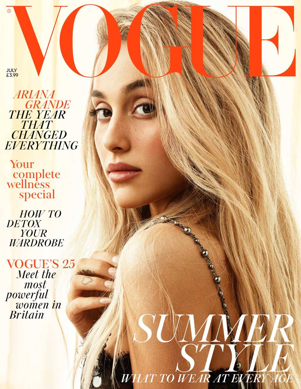
Image result for vogueI decided that for my typeface l wanted to experiment with both San-Serif and Serif fonts as l think they both have different finishes and can symbolise different meanings. For me, Serif fonts remind me of companies like Vogue, they're stylish, exciting and have a younger appeal. Whereas Sans-Serif fonts are often used to represent companies or products that are clean, minimal but also stylish.                                                                  My favourite fonts would be Didot and Sinhala MN as l think these both convey a young, modern and clean appeal. Something that l think would work really nicely to represent a media practitioner. Sinhala MN appears to fit some of my initial logo sketches better, as the letters flow smoothly and have a softer appeal in comparison to Didot. I think it also looks more unique, as the other fonts remind me of vogue and a have a closer symbolic appeal to the fashion industry apposed to the media industry. 

For what l want, simplistic, stylish, Sinhala MN is the better font and something l will test later when l come to create the digital versions of my logos. 

Colour Theory 

Although l had chosen colours from my original CV, again l wanted to experiment with different colour palettes and look into colour theory and representation of colours. I created a simple colour wheel and then colour combinations to see what colours l think worked well together and what is the best colours for my generic house styles of my brand. 

I chose four different core colours and then experimented with varying shades. I wanted to use softer colours as l want to have more muted and pastel house colours to create a softer appeal and to put more emphasis on the content on the website in comparison to if l used more harsh bright house styles it would take the emphasis away from my websites content. 

I used purples and lilacs as it represents a more luxury appearance and is elegant, while still being playful and exciting. I thought the lilac shades were different and a unique colour choice for a branding, it stands out without being a offensive colour. 

I used blacks and greys are neutral tones that are timeless. I like to incorporate black, grey or white into my designs to add a level or power and authority, to present my confidence and position in the industry. These cool toned colours are also great to balance out colours and they go with the majority of colours on my colour wheel. While presenting a modern style, blacks and greys promote the seriousness of my brand and the legitimacy of my experiences and career ambitions.  

Outside of my comfort zone, and usual colour palette, l decided to also incorporate muted reds and oranges as l thought the pop of colour could be a fun add in to my ouse style and something that would catch the attention of my audience. These colours feel exciting and fresh, but my main concern would be whether they are too youthful for the brand l am trying to achieve and would they soon become outdated? I want the colour scheme l chose to grow with me as a professional, which is why l avoided bright colours as l think l would grow beyond the brand and have to re-stylise it, which is something l don't want to do when l move into the media industry as it would mean altering all of my design assets. 

After combining colours together and experimenting with them, l want to trial the lilac and grey colour scheme, as l think it is stylish and unique without being too much. I want to use these as my general house styles for my website, branding and social media. 

Wednesday, March 20, 2019

Creating a Brand: Logo Development

Although l described in my last post about how l wanted to use my name as the logo as hat was something l discovered when researching into people within the industry, l also wanted to experiment with different logo designs and to see if they could represent my branding any better.

For all these designs, l used my name and initials as the main focus as l want to brand myself as multi-skilled l thought presenting my name as you do with a company would give my portfolio a sense of professionalism. I also found that in my research people either refer to themselves in the third person or would have their name in their logo and contact email address and not anywhere else on the website. So, l thought that using my name as my logo was the easiest way for users to identify me and my role within the industry.

My Sketches 

When designing anything, l like to begin by drawing out my basic ideas and any sketches l want to
out to see what they look like visually. For me, logo development is an important stage of this whole process as this is what your identity will be and you can really begin to brand yourself within your logo and get across the tone of your work within your logo.


 For my first design, l wanted to play around with the A section of my initial, and l thought it would be interesting to see what it looked like to write my name over my initials and merge the two together to create a more complex logo. I wanted to try out this logo design because l thought it looked quite corporate, but also simple, allowing me to symbolise my seriousness about the industry in a stylish and contemporary form. Creating a good logo allows me to showcase my design skills and creativity so this is something l wanted to play with in my initial sketches.


For this design l took inspiration from the more modern business designs that incorporate lines and graphics to the outside of their logo. I also took inspiration from my own logo designs l did for my Final Major Project, as they were for a futuristic company, so l thought the harsh outlines around my name made it more noticeable, different and futuristic. As the media industry is competitive l wanted to make my name stand out and create a design that is unique and had an impact - and l think that's what this design does.

I also tried out this same technique on my initials, however l didn't like this effect as l thought the outline took away attention from my initials.


To add some variety into my designs, l decided to incorporate a graphic into the logo. Although this isn't something l want to have in my overall design because l think graphics can age quickly and make m portfolio look outdated, l did want to experiment mixing a graphic in with my name. I don't think it looks awful, however this isn't the branding l am looking for, l don't think it represents a media practitioner so therefore l don't think l want to use it.

I will design this in photoshop to see what it looks like incase l change my mind. 


Lastly, l sketched out my original logo that l created for my CV. This is just simple, the visual hierarchy of this is nice, how the two names fit together. I like this kind of simplicity and when l create my designs virtually l think this will be fun to experiment with different colour-ways and typography because l think this logo has a level of sophistication and style l want my brand to have.


Creating a Brand: Logo Development, Initial Ideas and Influences

I have started to look at logo design and how l want to brand myself and what l want to define myself as. Although l am aspiring to get into the casting and that aspect of the media for the purpose of my portfolio website l want to brand myself as an all around media practitioner, with a specific focus on  the TV and Film industry.

In my research l have found that people use their name or a graphic as their branding instead of their photo because it makes it look professional and it also eliminates any threat of being discriminated against because of your appearance (although hopefully this shouldn't be the case anyway). So although l want to use my portrait picture on my social media accounts such as my Twitter and Linked In, l want to keep my website professional by only using branding, this way people can see the work that I've done through my show reel and material l am showcasing and then go onto my social media accounts for further exploration. 

To start off the design process l have taken my existing branding l have on my current CV as l think it is a contemporary design and represents me well. I decided to experiment with the core colours to alter the appearance of the branding to see what different variations of the same logo would look like. I used the four core colours presented on my CV, black, white, grey and lilac. I like this combination of colours and they compliment each other well and it is easy for users to read my name as the text can be clearly read. 


I do like how simplistic and sophisticated this looks, although l will experiment with other designs to see if one suits my branding more. At this current moment l don't want to use a graphic as l think it'd become outdated quite quickly as we're constantly changing trends and moving into new styles.


Tuesday, March 12, 2019

Research: Portfolio Research #2

Portfolio Research #2

As l stated in my last blog post, l focused more on casting companies like Casting Collective and Universal Extra's because they are some of the big companies for casting in TV, Film and commercial shoots. But these websites are quite generalised and the individuals working for them don't have a portfolio for me to evaluate. So instead l am looking at more general photographers, editors and people within the general media production industry because although this isn't my desired career, these job roles are things l would like to get into and start gaining more experience in.


IKY 

IKY is a second year TV production student who promotes himself as a photographer, videographer and editor, so similar to how l want to promote myself on my portfolio. Although he is a 'amateur' production student l thought it would be important to use his profile as a comparison to more 'professional' individuals within the industry. When you first enter his website you can clearly see that photography is one of his main focuses, as the homepage is a 'album' page for him to showcase the different types of photography he works in. I thought this allowed clarity with each album as it's made clear what they are and the purpose of the images.


When you actually click onto the gallery page l personally found it quite over whelming, because in comparison to his 'Album' page, these images weren't organised and were spread across the page at random with no order or clear visual hierarchy. Although this style is appropriate for a 'gallery' page, l thought it was a lot to take in visually and l couldn't focus on individual images which took away the impact of the images themselves.


In my opinion, l didn't think a extra gallery was needed as the majority of these images are shown within the albums he has on his initial page.I think he could of combined these two pages together, as it feels unnecessary to repeat information. Although, l do like the simplistic style he's gone for, as visual content has a bigger impact then pages of information.

His 'About Me' section actually deviates away from the norms I've been seeing on professional portfolios as he describes himself in first person rather then third person, and discusses more about his aspirations and motives rather then any professional experiences he's had. Although, this is a aspect l am going to take inspiration from, as l don't have that much experience within the industry so will need to discuss more on my motives and enthusiasm, as enthusiasm is something that is a desire personality trait within casting.


Overall, l like the simplicity of his website as he makes it clear what he enjoys and the work he does, without having to explain it all, although l think contextualisation on some of his content would of been nice so you can understand what camera he used, why he took that photo and his motives for his individual shoots.

His website coheres onto his Instagram, as he uses similar imagery and has the same style within his content however he doesn't use his logo as his profile picture, or have it anywhere on his Instagram which l think could be a improvement.

Chris Urmstom - Editor

I discovered Chris through a connection on Linked In, he is currently the senior editor at a film company called Aspect. I decided to look into Chris' profile because l have had the most amount of experience in editing so it's the role l am most confident about within the media industry. I thought it would be interesting to see how his profile differs to someone like IKY, a photographer.

Like all the other portfolios l have researched into, his is simplistic, with only three main pages on the whole site making it easier for the user to navigate around his website and find the relevant information they are after.

His homepage is also his portfolio, so it's a collection of images which once clicked on open a new page that shows you the video content. Chris has used a simple layout to ensure the user is clear on what to click on and the purpose of each video. This also makes it more fun and interactive for the user as you get to actively see the work Chris has done.

I like this layout a lot because of how clear his logo is, it says within his logo that he is a film editor so as soon as you enter his website you are aware what he does and that it is a portfolio website for his work.


His Archive page also coheres and follows the same conventions as his homepage but this time it categorises his content so potential employers or users can see the content he's created for different industries. This makes the general user experience easier as you can easily navigate to the information you want to find out.

Finally, l found his 'About' section quite unique, as he doesn't share an extensive amount of information. He has one line describing how many years experience he has and his current job role which l found fascinating as although it's not a lot, it makes you feel intrigued and want to find out more information about him. This one line description symbolises confidence, something that you need to have in the media industry to become successful as you need to be confident in yourself and your abilities.

I also found it interesting how he uses a image of himself, as this is something I"m not sure l incorporate into my website as it might cause discrimination if people know what you look like -  which it shouldn't, but this is a concern l have about using a image of myself on my website.


My main learning points from this research:

  • Keep my website simplistic, not too many pages and features.
  • Don't repeat imagery or information too much as it gets receptive and boring for the user.
  • Describe my motives to be within the media experience.
  • Present myself with confidence and enthusiasm. 


Research: Portfolio Research (General Observations)

https://www.yateswildlife.com - Icon films Worker 

https://www.phoenixcasting.tv - Casting Website

http://www.ruinedlou.com - Stylist costume designer


As l mentioned in the previous blog posts l have found it difficult finding exact blogs for people that are within the casting industry as freelance casting directors seem to be a niche area within the industry as they tend to work for bigger casting companies or production companies.

I started off by looking at people l already have connected with on Linked In as they have either gone to our university and I've met them previously or they're simply a connection I've found on linked in. These people all work within the media production industry, because although l want to eventually end up within the casting industry l enjoy lots of aspects of media including post production and filming.

I found that the majority of these portfolio websites were quite simplistic and had a short description of their job aspiration or current job role as well as what the work they've done previously. In some cases their Instagram accounts were attached alongside their professional social media accounts so that users can follow these links to find out more about them and begin to follow them.

I found it interesting how they talk about themselves in the third person as this allows me as a audience to read about them without being bias and create my own opinions of their work. This almost makes it seem like their portfolio website is also their biography, which l think interesting as you get to read about them and learn about their work and lifestyles apposed to them telling you what they do, who they are and what they want. It feels more like you're learning about them opposed to being told about them. This is an interesting aspect l want to take on when creating my website as it seems to be a professional conduct when creating a portfolio.

Sunday, March 10, 2019

Research: Identifying myself as a Media Practitioner

What I'm branding myself as?


After conducting research into the casting industry and not being successful in discovering many individuals who have a specific portfolio for casting work, l have decided that l am going to promote myself as a general media practitioner. This allows me to show a collective of work and showcase my varying skills I've learnt from university. Although l want to promote myself as a media practitioner l will chose specific areas that l am most confident with, for example video editing and design work. This is so my portfolio will target different sectors within the media industry and give me the best chance of finding a career within one of my preferred areas or the areas l have the most experience in.

I found in my research that a lot of upcoming talent discuss their aspirations, so although casting isn't my main priority for my media portfolio l think it's important to discuss that this is my desired career aspiration and something l would like to gain experience in. As it's such a nice industry l think it's important to show interest in the industry while also appearing to be multi-skilled and having worked on TV productions before, l can show that l have worked within the industry before as well as having produced my own work, which will make me more employable.

Wednesday, March 6, 2019

Research: Casting

In order for me to progress in this module l need to do some research into casting as this is a career path l am interested in pursuing but l know very little about the industry and no previous work experience in it!

I started off by looking at contacts l had already made via sites like linked in and finding people within the industry and then doing more research into them. But l found that they had profiles within their casting agencies and l have yet to find people who have a stand alone portfolio website for themselves. I will do more research as I'm sure that some people do and l would like to see how they market themselves within the industry. As l couldn't find many casting directors with their own websites l simply looked at their individual profiles on places like Linked in and Twitter and found that they advertise themselves as social and well rounded individuals. They'd need to be very social and out going characters to be able to cast the right person for the role and this is something l saw within some of the individuals profiles.

The way l discovered these people was through agencies I'm familiar with such as Collective Casting, Universal Extras and Phoenix casting- l know these agencies as l have signed up to them to get extra roles within the industry! I also did further research and found more agencies such as Smile Casting and Tree Petts Casting. I would like to contact some of these agencies and just query them on what it is you need to become a casting assistant/director and if they have any experience opportunities l could have!

I will also expand my search into other areas in the industry I'm interested in within the media industry as l think l want my portfolio to be a compilation of my best skills and interests to showcase my skills and production work. I will expand into further career prospects into the film and TV industry such as becoming a production assistant/runner or editor! I'm interested in the majority of media production so l feel like l have a lot of different routes to go down.


Monday, March 4, 2019

My Initial CV Design

To start off my work experience l needed to make a creative CV so that l could start applying to companies l was interested in and to exhibit my experience and skills. I decided to go with a 'one glance' CV so that companies can see what experiences I've had, what I'm interested and what l do in a limited space. I decided to do this because they get a glance at what I'm like, but there's still more to learn about my which hopefully they'd be interested in getting to know me in a interview or a phone call.

I enjoy design and wanted to exhibit this in my CV and use it to create a visually unique document that would get attention from potential employers. I wanted to use a soft colour scheme and bold text so that it is easy to read while also being stylish and contemporary.

This is the initial design for my CV and something that l do want to incorporate onto my portfolio because l like the design of it and it might be something l will use to base my website on.


My Finished Portfolio Website

https://lisalouiseadams97.wixsite.com/mediapractitioner